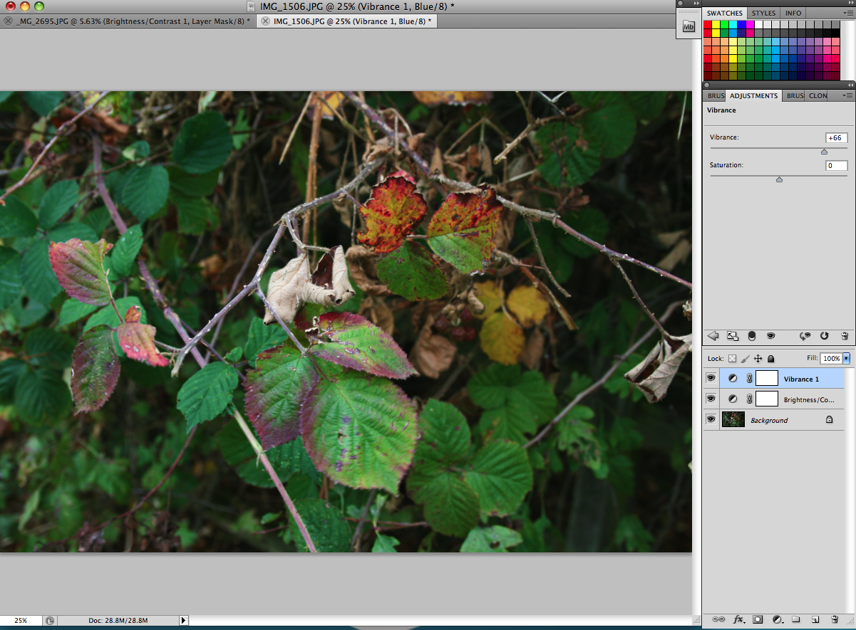
I chose JPEG for my final image format so that I could access the photographs at home but I also kept a copy of the photoshop format so that if I wanted to then I could re-edit the images.
Black and white conversion
I chose this method for this photograph as the image already had a spooky look so I wanted to make it look even more spookier and take out some of the brightness by removing some of the colour and making it darker.


Before After

I changed the black and white adjustments so that the green colour would appear darker.


I then adjusted the fill to 88% so that all the colour wasn't removed from the image but the spookiness was there without it looking old fashioned.
Before and after demonstrating significant improvement to quality
I chose this image to do photoshop as the model had a few imperfections that I wanted to remove from it, also a bow from the model's bra was showing so I wanted to make sure that this was removed as I wanted this image to be perfect.
After removing the imperfections I carried on photoshopping the image so that the background and blue outfit were brighter.

Before

After

To get rid of the bow I used the dodge tool so that I only clone stamped out the bit I wanted to.

I then altered the size of the stamp so that I didn't clone too much and ruin the image.

I then cloned the part of the image I wanted to stamp over the bow to create the desired coverage.

Crop and resize
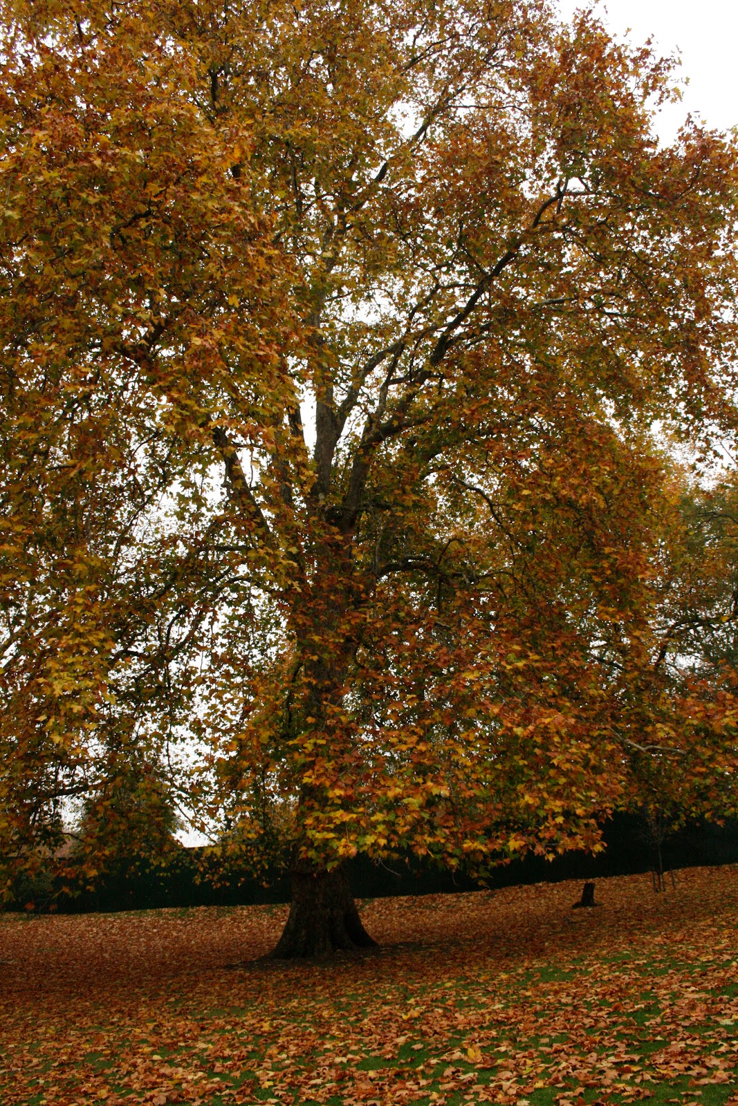
I chose this image as they was a building in the background that I wanted to crop out so that the focal point was not taken away from the autumn colours. I also wanted to the size and resolution of the image to what I wanted.
I used the crop tool to crop the image as this was the only tool I knew that could crop and resize.

Before

After

This is the size and resolution I chose.
Masking and selection
I wanted to put a background to this image so I decided to use the masking and selection method. I found an image on google that I could use as the background. I wanted the image to look more fierce than what it was so I used flames to contrast with the blue dress.

Before

After


To delete the background I had to use the background eraser tool. I had to change the tolerance of the eraser so that none of my model was deleted.

I had to select the background colour so that the colour of the background would be erased and not the model's skin and hair as it was a similar colour to the background.

I used the eraser until all the background was gone including around her hair.

I then dragged the image I got off google into photoshop and then dragged it into a separate window to the photograph as it was easier to do that way.

I then selected around the image of the model.

I cropped the picture off google so that it was the same size as the picture of the model.


I then pasted the selected image of my model onto the image off google.
This image is also a combination image from at two different sources like the image below.
Combination image from at least two different sources
I chose the method for these two image to combine them together as one as it shows a neutral pose with a pose with props were the model is wearing the same outfit so they are quite similar. I wanted to combine these images so that viewer could see two different sides of the model.

The two separate images put together

I opened a new page (A3 sized) and copied one of the images onto it.

I then scaled my image down to the size I wanted and moved it around on the page to where I wanted as well.


I then created a border around the image so that it stood out as the page and the background of the image was plain.

I then did the last 2 steps with my other image.